As we approach 2026, interior design experts are unveiling an exciting palette that promises to transform Indian homes with a fresh, nature-inspired aesthetic. Moving away from the muted neutrals that dominated recent years, the upcoming trends embrace bold, organic colours that bring warmth, energy, and a connection to the natural world into our living spaces.
The Rise of Persimmon Orange
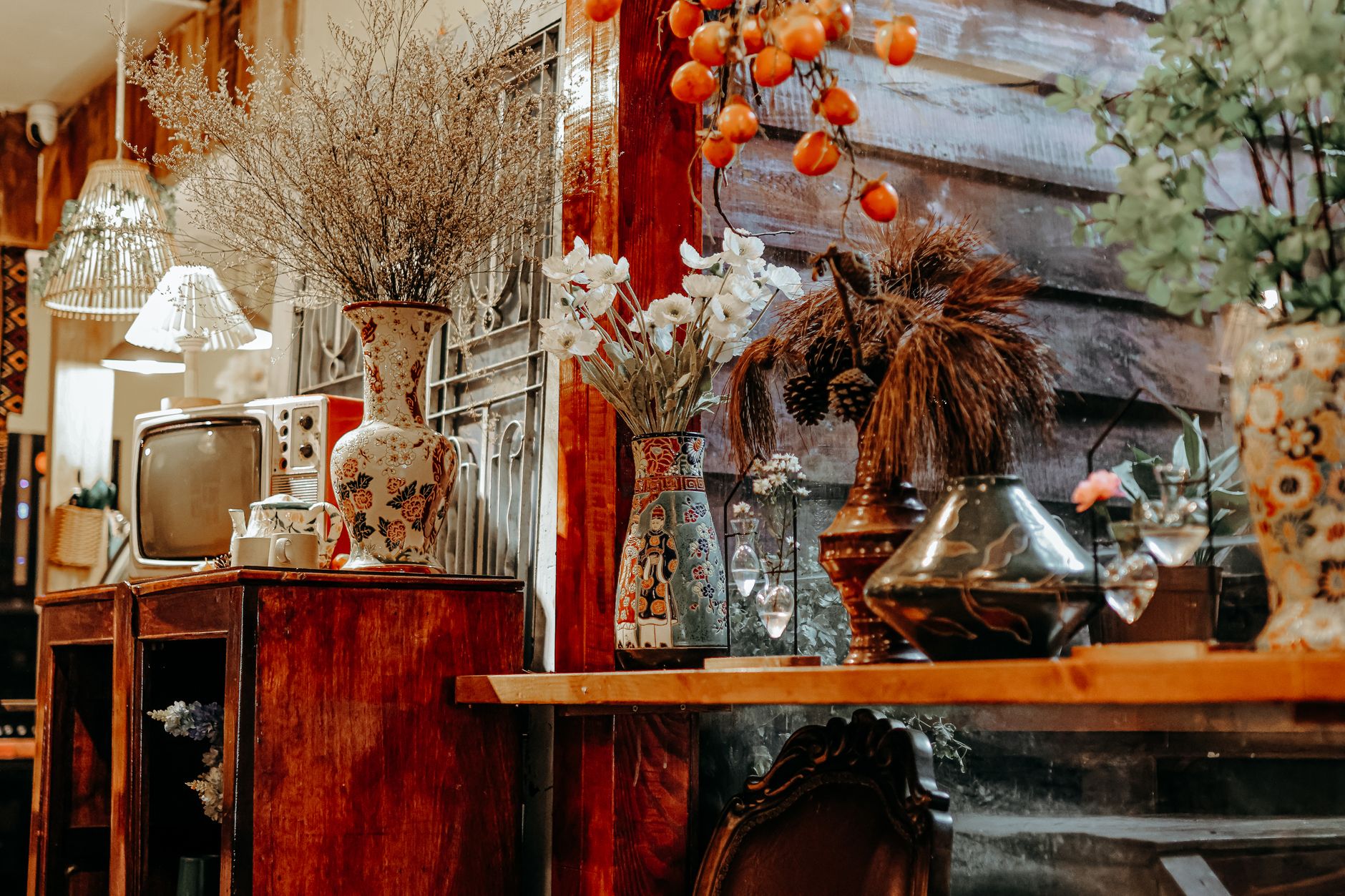
Persimmon, a rich, warm orange reminiscent of the ripe fruit, is set to become one of 2026's standout colours. This sophisticated shade sits between terracotta and coral, offering a welcoming warmth without overwhelming a space. Unlike the bright, aggressive oranges of the past, persimmon carries an earthy sophistication that works beautifully in Indian homes, complementing both traditional and contemporary aesthetics.
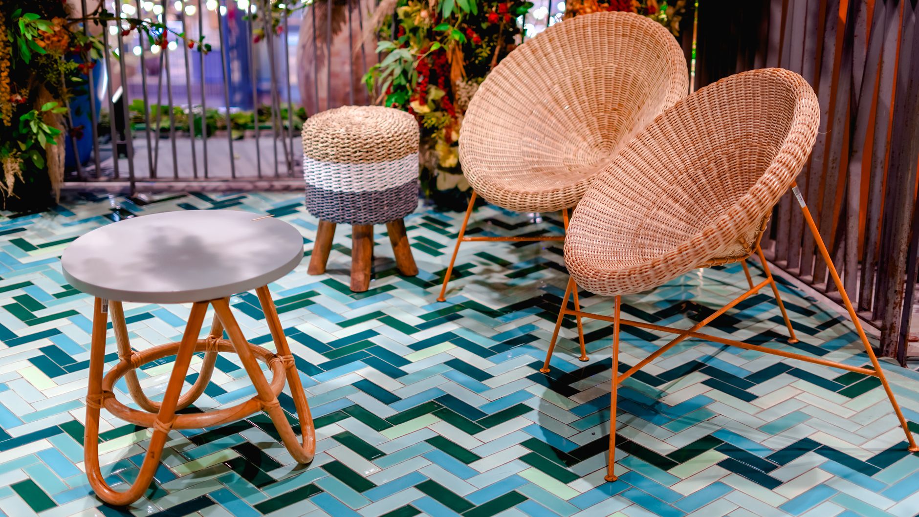
This colour works exceptionally well in living rooms as an accent wall, particularly when paired with natural materials like jute, rattan, or light-coloured wood. For those hesitant to commit to a full wall, persimmon cushions, throws, or artwork can introduce this trend subtly. In dining spaces, persimmon pottery or table linens create an inviting atmosphere perfect for gatherings.
Wasabi Green Takes Center Stage
The second major trend, wasabi green, brings a fresh, energizing quality to interiors. This pale, yellowish-green shade evokes Japanese aesthetics while maintaining a universal appeal. Unlike darker forest greens or bright limes, wasabi offers a gentle, soothing presence that promotes calm and creativity.
Wasabi green shines in home offices and study areas, where its subtle vibrancy can enhance focus without causing distraction. It pairs beautifully with natural wood tones, white fixtures, and metallic accents in brass or gold. In bathrooms, wasabi tiles or painted cabinets create a spa-like atmosphere, while in kitchens, this shade on cabinets or backsplashes adds personality without overwhelming the space.
Where to Use These Trending Colours
**Living Rooms**
- Persimmon accent walls behind seating areas
- Wasabi green curtains or upholstered furniture
- Combination of both colours through artwork and decorative accessories
**Bedrooms**
- Soft wasabi green for master bedrooms promoting relaxation
- Persimmon bedding or headboard in guest rooms for warmth
- Layered neutrals with colour pops through cushions and throws
**Kitchens and Dining Spaces**
- Wasabi green cabinetry with natural wood countertops
- Persimmon dining chairs or crockery displays
- Colour-blocked walls combining both shades for visual interest
**Bathrooms**
- Wasabi tiles in shower areas
- Persimmon towels and bath accessories
- Plants that echo these natural hues
Complementary Palette Considerations
These trending colours work best when thoughtfully paired with complementary shades. Persimmon harmonizes beautifully with cream, beige, soft grey, and deeper browns. For a more dramatic look, pair it with navy blue or charcoal. Wasabi green complements whites, light woods, soft pinks, and even touches of black for contrast.
Experts suggest using the 60-30-10 rule: 60% neutral base colour, 30% your primary trend colour (persimmon or wasabi), and 10% accent colour. This ensures the space feels balanced rather than overwhelming.
The Psychology Behind These Choices
The shift toward these nature-inspired hues reflects a broader desire for wellness and connection to the outdoors, particularly relevant in urban Indian homes where green space may be limited. Persimmon's warmth promotes social interaction and comfort, while wasabi's freshness encourages mental clarity and renewal.
These colours also align with sustainable design principles, as they're inspired by natural elements and tend to remain timeless rather than feeling dated quickly. In a country like India, where colour has always played a significant role in cultural and domestic life, these trends feel both contemporary and rooted in our innate appreciation for vibrant, meaningful hues.
Making the Transition
For homeowners looking to embrace these trends, start small with removable or changeable elements like cushions, artwork, or small furniture pieces. Test paint colours in different lights before committing to walls. Consider the room's natural light, existing furniture, and overall home aesthetic to ensure these bold choices enhance rather than clash with your space.